
Without colour coding in professional cleaning, most errors do not happen because someone “didn’t clean”, but because the system allows things to mix that should never be mixed.
A cloth used in a washroom and then taken into a shared area, a mop passing through two rooms without being changed, or a trolley where clean and used textiles sit in the same compartment. These are silent failures: at first glance, everything may “look” clean, but the risk of cross-contamination and rework increases.
That is why using a colour code has become standard practice in many sectors, especially in healthcare environments. It is not a trend or an obsession with “keeping things tidy”. It is a practical way to turn complex rules, such as “do not mix”, “change by area” and “separate by risk”, into something that can actually be applied in a corridor during a pressured shift.
There is no single universal colour code for every sector or country, but it is a widely used practice in cleaning companies, facilities management and hygiene-sensitive environments because it turns complex rules into a simple visual system. What matters is not the exact colour itself, but that each site defines what every colour means, by area or risk level, documents it and keeps it consistent across shifts and trolleys.
This article has one very practical goal: by the end, you should be able to explain clearly and simply which colour map to use, how to adapt it to your facility and how to check quickly whether it is actually being followed. This guide is useful whether you manage the service and need a method, or whether you need a senior decision-maker to understand why this kind of standardisation is worth the investment.
What colour coding solves and why it is widely used in healthcare
A colour code separates cleaning materials by area or by level of risk, and it does so in a way that teams can apply without relying on previous experience. In healthcare, this is especially useful because the work combines high-touch surfaces such as handles, examination couches and bed rails, wet areas such as washrooms, transit zones such as corridors and waiting areas, and rooms with very different requirements such as consultation rooms, bedrooms or treatment spaces.

When colour coding is properly implemented, four clear improvements usually appear.
The first is a reduction in routine-based mistakes. Staff no longer need to stop and think about whether a cloth is suitable for a given area. The colour decides. This matters especially where there is staff turnover, split shifts or temporary cover.
The second is service consistency. Two different people can clean the same area in a similar way if the system clearly shows which material they should use. Quality becomes less dependent on the individual.
The third is easier supervision. A supervisor can spot deviations quickly: if they see red outside a washroom, a rule has been broken. If they see mixed textiles on a trolley, the process is not properly defined.
The fourth is easier purchasing justification. For the manager who approves the budget, a colour code is not about “buying more”. It is about buying better: standardising in order to reduce incidents, rework and variability. In other words, it turns consumables into a control system.
Colour map by area: the most widely used layout and how to adapt it
There is no single universal standard, but a four-colour system is widely used because it is simple. The important point is not the exact colour, but that the facility defines it, documents it and keeps it stable.
| Colour | Area / risk | Typical use | Operating rule |
|---|---|---|---|
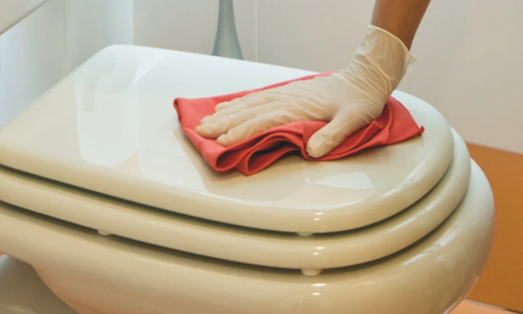
| Red | High-risk washrooms | Toilets, urinals, bidets, critical bathroom points | Never leaves the bathroom |
| Yellow | Medium-risk washrooms | Sinks, taps, tiles, mirrors, showers | Bathroom only, separate from red |
| Green | Food areas | Kitchens, service areas, food handling zones | Food areas only |
| Blue | General areas | Bedrooms/consultation rooms, corridors, furniture, glass depending on site | Never enters bathrooms or kitchens |
Sector examples: how zones are usually defined
Healthcare: clinics, care homes and health centres
In healthcare settings, washrooms are usually split strictly into red and yellow, while clinical areas are often treated as “general” areas but with their own protocol for high-touch surfaces. Reception, corridors, waiting areas and consultation rooms may all fall under blue, while bathrooms are divided into critical points, such as toilets, and the rest of the bathroom. If the facility has special areas such as isolation rooms or spaces with specific precautions, it is often best to assign them one very clear additional rule, avoiding too many exceptions inside the same colour.
Hospitality and foodservice: kitchens, restaurants and catering
In hospitality, the priority is normally to keep food areas clearly separate from the rest of the site. Kitchens and food preparation areas are assigned green, and that textile should never enter washrooms or general areas. Bathrooms keep their own red and yellow split, while blue is used for dining rooms, bars, shared areas and general surfaces. This layout helps staff avoid carrying habits from one area into another during busy periods.
Offices and education: corporate sites, schools and universities
In offices and education settings, the biggest risk usually sits in washrooms and shared high-traffic areas. Blue often covers classrooms, offices, desks, furniture and corridors, while red and yellow are reserved for washrooms. If there is a kitchenette or internal café area, it is advisable to keep a dedicated green even if the area is small, so food-area textiles do not end up cleaning general surfaces, or vice versa. Simplicity is essential here: few rules, clearly visible, so the system survives shift changes and staff turnover.
This map works well because it separates the two things that almost always need to be kept apart: washrooms, with their higher cross-contamination risk, and food areas, where relevant. Everything else can be treated as a general area.
That said, every site has its own details, and this is where a practical approach matters. You can adapt the map with three decisions that close the system without turning it into an impossible manual.
1. Define what counts as a “hygiene-sensitive area” in your site
In a clinic, for example, the washroom is always hygiene-sensitive. A consultation room may be treated as a general area with a protocol for high-touch surfaces. A treatment room may need its own internal rule. The important thing is that the site defines it in writing, even if only in one sentence.
2. Keep one simple rule: one colour = one area
Systems fail because of exceptions. As soon as “it’s fine just this once” appears, the colour code becomes decorative. A slightly less perfect map that is stable will always work better than a more complex one full of exceptions.
3. If you need a fifth colour, give it one single purpose
Sometimes in healthcare a further distinction is added, for example for isolation areas. If an extra colour is introduced, it should have one single function and very clear signage. Otherwise, the system becomes more complicated and loses effectiveness.
One final point often helps: colour coding becomes much stronger when it is combined with the right textile choice for the surface and the level of risk. To expand that decision-making process, you can also refer to our guide to microfibres for healthcare cleaning.
Implementing colour coding without making it complicated
Knowing the map is easy. Embedding it into day-to-day operations is what makes the difference. The good news is that there is no need for a huge project: a colour code can hold up through four basic elements if they are done properly.
The first is the trolley or shift kit. The quickest way to make the team follow the system is to ensure that the trolley is already prepared with what they need: textiles by colour, one clearly marked space for clean items and another for used ones, and colour-identified holders for tools. When the kit is always the same, the method becomes almost automatic.
The second is basic signage. There is no need for a beautifully designed poster. What matters is something visible and functional: one label on the trolley with the summary map, and another on buckets or tool holders. The goal is for anyone to understand it in 10 seconds, even on their first day.
The third is short, repeatable training. In professional cleaning, the training that works is not the longest, but the easiest to repeat without friction. A short script is usually enough if it includes: what cross-contamination means, using an example from the site itself, the colour map, the two main rules, red and yellow never leave the bathroom, and used textiles never return to the clean circuit, and what to do when a mistake is spotted.
The fourth element, and the one that breaks the system most often, is stock by colour. If the right colour is missing, someone will improvise. Not because they want to, but because they need to finish the shift. That is why it makes sense to define a minimum stock by colour in the cleaning room and a simple replenishment rule. Even without software, this can be managed with a basic record sheet or a fixed weekly check.
Frequent mistakes and how to spot them quickly
Colour codes do not fail in theory. They fail in routine. And usually for the same reasons.
The first is the exception: “just today”, “just this once”. If the system allows exceptions, it stops being a system. In healthcare this is especially visible in washrooms: if red or yellow is used outside them, the map starts to break down.
The second is the mixing of clean and used textiles. A trolley with used cloths inside the clean compartment is a clear sign that the process is not working, even if the colour map is stuck on the side.
The third is insufficient stock. Sometimes the person in charge feels the system “does not work”, when in reality the replenishment process does not work. When colours are missing, improvisation appears.
The fourth is the absence of visible supervision. There is no need to “police” the team, but there does need to be someone clearly responsible for correcting an error immediately, without punishment and without endless debate: it is corrected and the work continues.
To make control easy, here is a very short review that a supervisor can carry out in two minutes per trolley or shift, and that senior management also tends to understand very well because it is operational control:
- Is the colour map visible on the trolley?
- Are buckets or tool holders identified by colour?
- Is there a clear separation between clean and used textiles?
- Are bathroom textiles kept داخل the bathroom circuit only?
- Is there a minimum stock by colour in the cleaning room?
- Can the team recall the two main rules without hesitation?
- Is there a clearly identifiable shift lead?
If several of these points fail at the same time, it is usually not a people problem. It is an implementation problem: kit, signage, replenishment or supervision.
HeySupply: experts in supplies for professional cleaning
At HeySupply, we work with companies that need to standardise consumables and operating methods so that service remains consistent across people, shifts and sites.
- Selection of cloths, microfibres and mops by use and by area
- Trolley or shift kits and minimum stock by colour to avoid improvisation
- Support with signage and full team training
- Structured replenishment to keep the system stable
If you tell us what type of facility you manage and how the service is organised, we can help you define a simple colour map that can be applied from day one.